Introducing the Recipe Detail Page
Recipe Detail Page
To make better use of device screen space, clicking on a recipe now takes you to a full-screen ‘recipe detail page’ where everything needed for meal preparation is displayed on a single bookmarkable page.
The page incorporates a number of aspects from Monica’s screen designs, including the ability for the user to hover-to-highlight recipe direction steps.
Recipe Scaling
If you’re eagle-eyed (or had been waiting for this feature) then you may have spotted that the ‘servings’ field on the recipe details page is an edit box.
When viewing a recipe (via the recipe detail page) you can now adjust the number of servings, and the quantity of the ingredients will automatically be updated to match.
Note that this feature isn’t hugely ‘smart’ yet. It doesn’t, for example, understand that the concept of one-and-a-half eggs may not make much sense. There’s more work planned to improve the functionality it provides - and it would benefit from your feedback and testing, too!
Coming up next
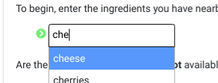
We’ve made some progress investigating how to provide spelling corrections during ingredient name search on RecipeRadar, and have discovered a open source software library called fast-autocomplete that looks ideal for the purpose.

Work has begun on integrating this library with RecipeRadar, and there should be more news on this soon.
We should also be making some decisions regarding selection of a user interface framework (for the application interface) and a graph database (for ingredient knowledge representation and storage) within the next two weeks.